
Copyright April M Rimpo

Visit April's website www.amrart.org
Copyright April M Rimpo All Rights Reserved. You may share my work with attribution and a link to this source site, but all other uses are prohibited.

Thursday, June 14, 2012

Flores - Watercolor 22" X 30"

watercolor by April M. Rimpo of Flores, Guatemala
"Flores", 22" X 30", by April M. Rimpo
My first night after arriving in Guatemala I found myself sitting in the hotel’s outdoor restaurant looking across the lake at the beautiful town of Flores.  The red roofs, prevalent in Guatemala, all reflected in the lake taking my breath away.  I found the view terribly relaxing and I felt I could stare at it for hours, and as I recall I did.  I decided to paint this scene in hopes of sharing this beautiful moment.  My goal was to focus on the reflections and decided to add a person in his dugout on the lake to bring additional interest to the water.  Later in my visit to Lake Atitlan, in central Guatemala, I had seen men use their dugouts on that lake.  I transported one to Flores; I hope he doesn't mind.   My goal is for people to feel the serenity I felt that first night in Guatemala.

Flores
watercolor
22" X 30" image
Original SOLD - Prints available


14.5" X 20" Limited Edition giclee print on watercolor paper with 18" X 24" mat available in April's print store. You can get prints as large at 44 X 60 on gallery wrapped canvas.  Contact April to discuss the size print you would like.  

Here is the final installment on the creation of "Flores".  You can see that I did add more blues and lavenders across the entire background, added a few more splashes of color and details in the city buildings, and added the man in his dugout.  Other posts on this painting can be seen at
Click here to Contact April

Interested in learning more about April's art inspirations, tips about her painting process, or art business tidbits? Want to know when her art is in exhibits? Consider joining her friends and collectors by signing up for her twice-monthly email.

Copyright April M Rimpo All Rights Reserved. You may share my work with attribution and a link to this source site, but all other uses are prohibited.
Monday, June 11, 2012

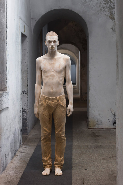
Amazing Wood Scupltures


Sculpture by Bruno Walpoth
Although I don't strive for photorealism in my figure painting, the wood sculptures by Bruno Walpoth seem to almost achieve photorealism.  It is astonishing what he can achieve in wood.  I don't think of wood sculpture in this way.  Follow the link provided above to see other examples of his work.
Anjeli prichádzajú

Other fascinating wood sculpture by Juraj Čutek and ceramic sculpture by Vladimír Oravec can be seen atehttp://www.spectrum-art.sk/anglictina/vytvarna-sekcia/vytvarna_scena-umelci.html .  I especially like Oravec's sculpture Angel's Come shown at right.


Wednesday, June 6, 2012

"Flores" - Next step after Aerial Perspective

My post called Aerial Perspective showed a portion of the background of my painting titled, "Flores".  Today's blog discusses the beginning of the buildings in that painting.  You might recall it is the reflection of the red roofs and other details in the water that will be the focus of the painting.  But before I get to that you might be wondering, what happened to the blues and lavenders in the distant hills?  This is a different part of the painting from what I showed in "Aerial Perspective"; I had not yet added those colors to this section.  When I paint I tend to work one area then move to another.  I frequently develop one section to completion to verify my approach and later go back into the other areas to apply the same technique.  As you can see without the blues and lavenders the hills look distant but rather gray and uninteresting.  Since I love color, leaving gray is difficult for me to do unless the subject calls for it.  I wanted to communicate the beauty of Flores so the grays will go. Trust me on this.

Red tiled roofs abound throughout Guatemala; even the ancient buildings in Antigua, Guatemala had red roofs.  My focus here was getting the buildings on the hillside to stand out as being at different levels, layering one on top of the next.  Since they all had red roofs, I varied the colors within the reds, creating a patchwork effect.  I also used more pale blues and grays in the distant buildings. To breakup some of the red I included some tan and concrete walls.  I didn't want to change the primary hue of the roofs since the red reflections in the water will be the heart of the painting.

At this stage the painting looks rather uneven. I still have many elements to add and the darkest darks are missing.  Having only lights and mid-range values make the painting appear a little flat.  Although I said earlier that I often take one area of a painting to completion before moving on to another section I do tend to wait for the entire painting to be nearly complete before I add the darkest values.  This way I can be sure I am placing these darks where they are needed to pop out a feature I think is important. If you use too many darks then they no longer help to enhance the focal point.  I'll get to those darks and the background blues and lavenders in another blog.

Copyright April M Rimpo All Rights Reserved. You may share my work with attribution and a link to this source site, but all other uses are prohibited.


Most Popular Posts This Month

Most Popular Posts of All Time