Copyright April M Rimpo

Visit April's website www.amrart.org
Copyright April M Rimpo All Rights Reserved. You may share my work with attribution and a link to this source site, but all other uses are prohibited.
Showing posts with label pigeons. Show all posts

Tuesday, September 8, 2020

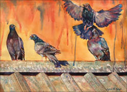
"They're Everywhere" 30" X 24" Fluid Acrylic by April M. Rimpo

They're Everywhere by April M Rimpo


They're Everywhere
Fluid Acrylic
30" X 24" image


Two of my favorite things combine in They're Everywhere: the colors of pigeons and painting with drips and splatters to create the illusion of a rocky cliff.

I know, so many people think pigeons are pests but I love their iridescent colors. I'm also amazed that no matter where I travel I see pigeons. I've done paintings of pigeons in Italy, Seattle, New Jersey, and now Colorado. 

They're Everywhere was particularly fun because of the way I created the background of this painting. I started by spraying water on the paper letting the water run in all directions, making rivers of water the went across and down the page, weaving a random pattern on the page. I then dropped on color, either with a brush or by using a pipette, and tipped the paper to make the colors blend randomly following the path of the water. I also added some splatters here and there that became the shadowed spots on the cliffs.  After drying I continued painting to refine the cliffs, but many of the random cracks in the rocks and shadows were already established from the first wet-into-wet wash.

I've included a video of me creating this painting; a time lapse over a week of painting. Enjoy!  I'd love to hear your feedback.


Post Updated Sept 8, 2020

Interested in April's artwork or taking one of her classes? Consider becoming a Studio Friend by signing up for her twice-monthly email. April segments her newsletter so you can select topics you'd like to hear about when you sign up. For those who Select the General Interest topic you will receive emails about twice-monthly. If you are only interested in classes, then the emails will be much less frequent discussing upcoming classes and how to register. Thank you for your support of April M Rimpo Art. Oh, and please be sure to click on the link in a second email to verify your interest in joining my newsletter. Without the verification you will be left in a limbo state where you will not receive my emails and I can't complete the verification on your behalf. If you receive a response that you are already subscribed, email me to confirm and I can send you a different link to update your profile and get the verification email resent to you.
Note: You may be taken to an error page asking if you want to proceed to my https://..... .php site. This is my secure site created using a php format. It is safe to proceed.

Copyright April M Rimpo All Rights Reserved. You may share my work with attribution and a link to this source site, but all other uses are prohibited.

Saturday, May 23, 2015

In Search of New Textures

What you likely know about my work is that I often like to include as much visual texture as I think fits with the piece.

Join the Crowd by April M Rimpo

Sometimes I drip or spray water on an area that has started to dry to force some small lighter areas, as I did on the background and in the feathers on Join the Crowd.
Join the Crowd
Watercolor
10" X 14" image
Framed in Brushed Silver Frame
$425


Poinsettia Tree WIP by April M Rimpo

Other times I apply paint and when it is mostly dry I spray it with water to remove the areas that are slightly wet leaving hard, yet organic, edges. You can see this in the leaves in the closeup of Poinsettia Tree, taken fairly early during the creation of this painting.  To see the completed painting click here.


The Apex by April M Rimpo
Drips are another favorite method of mine to create textures, as demonstrated in The Apex.  There is always a purpose when I use a texture since I feel the texture has to enhance the painting, not just be decorative.

Since I always an looking for new, interesting, and maybe faster ways to create textures I decided to take a mixed media class from Nancy Barch. First of all let me say that Nancy is a wonderful teacher, full of great ideas. The variety she uses in her work is fascinating. I knew from others who had taken her workshops how much she had inspired them to try new approaches in their art and I am so glad I took her workshop. 

Since I love the transparency of watercolor and fluid acrylic I was looking for techniques I could adopt and transform, as necessary, to enhance my work without being a major shift in style. 

Below are images of some of the work I produced in this workshop. You can see we used much thicker applications of paint on the first three pieces, but the variety of textures are magnificent.  My challenge over the next few months is to test methods to adopt Nancy's concepts and use them in a slightly more fluid manner to see if I can add more depth and nuance to my paintings.  I'm always striving to add visual interest and believe the new vocabulary of textures from Nancy's workshop will do the trick.
 
Abstract Flowers;  White on White;  7th & Carroll;  Lunar Blue; Destruction

Thursday, August 21, 2014

"Breakfast for Two", 36" X 24" fluid acrylic and watercolor

Breakfast for Two by April M Rimpo
Can you tell I like color?  There is something about orange, blue and purple that just makes a painting sing to me. Complementary colors, you've got to love them.

Breakfast for Two also has a nice balance between curves and the linear pattern of the tiles on the wall. I wish I could say that all of this was intentional design, but in reality it is what I saw one morning while have breakfast with my husband at a restaurant with outside seating. Now I know I was drawn to the scene because of the complementary colors, but I don't think the  balance between line and curve struck me until much later. 

That doesn't mean I didn't make some variations from my original photos.  I combined bird shots, substituted the restaurant plates for one of my own plates, altered the color of the crumpled napkin to continue the colors from the birds, and changed the leftover food on the back plate from what might have been leftover scrambled eggs to waffles.  Wouldn't any self-respecting bird prefer waffles?


Breakfast for Two
Fluid Acrylic and Watercolor
36" X 24" varnished in brushed silver frame
$1950 includes shipping within the United States


Of course those of you who follow my work also know I am drawn to pigeons.  They may be a nuisance, but you have to admit they are one of the more colorful birds in the United States.  Capturing all the variation of blues, purples, lavenders, and sometimes teal blue/green is just plain fun to me.

To see more pigeon paintings you might want to start at my post "Pigeons: Evolution of a Series."

Monday, July 22, 2013

Agora Gallery Exhibit, July 23 - August 13, 2013


Port of Call by April M. Rimpo
 
Pigeon Keeper

City Reflections III by April M. Rimpo
I have paintings in the "Interpretive Realms" exhibition at Agora Gallery in Chelsea, New York City, NY starting this week.  It is always exciting to be included in an exhibit, but there is something very special about an exhibit in New York City.  I've included here images of my art that will be on display and links to earlier blogs on these paintings.  

Agora Gallery is a contemporary fine art gallery established in 1984, dedicated to the promotion of national and international artists, providing original fine art to established and emerging collectors and catering to special events in support of fine art organizations that foster social awareness and promote environmental issues.  The gallery is also the publisher of ARTisSpectrum Magazine and the sponsor of ARTmine.com. You can find April's profile in ARTisSpectrum Volume 29: The Chelsea Perspective.

Here is the Press Sheet they released regarding my art.
American artist April Rimpo paints luminescent compositions in watercolors and fluid acrylics whose glowing hues and evocative textures are in sharp contrast to the softer tones typical of most watercolor paintings. Her transporting imagery renders scenes both familiar and distant — from American cityscapes to picturesque vistas in Europe or Latin America — in vivid, bright colors. Though her work is firmly rooted in realism, she also allows her paints to flow, meet, and meld, injecting elements of chance into her carefully and dynamically composed paintings.
“I watch it flow and respond, allowing the piece to develop in directions not fully planned,” Rimpo says of her method. “This is part of the thrill of working in watercolor that I didn’t find in other media.” She intrigues viewers by juxtaposing areas of near-abstract color with precisely outlined and filled in elements. This incredible variety of modes of application and imagery leaves her audience to complete the details of areas which have been washed over in seductive and dramatic hues, drawing them into the work.
A video of the reception held on July 25, 2013 can be seen at
http://www.youtube.com/watch?v=gwWMWB3LBBI.

Blog postings about these paintings:
Contact April here

Interested in learning more about April's art inspirations, tips about her painting process, or art business tidbits? Want to know when her art is in exhibits? Consider joining her friends and collectors by signing up for her twice-monthly email.

Copyright April M Rimpo All Rights Reserved. You may share my work with attribution and a link to this source site, but all other uses are prohibited.

Sunday, January 6, 2013

A Review of 2012

2012 was a wonderful year for me. I've been able to focus full time on my art, enter national exhibitions, work with new galleries, learn about the business side of art, and enjoy memories by painting people and places I know and have visited.  I have to thank my wonderful husband, Chas, for all of his support this year, which has contributed in so many ways to my success.
 
The video above includes examples of the art I created and exhibited during 2012.  All paintings I exhibited nationally are included here as are a few examples of portraits I painted for a book of Family Portraits completed in 2012.  Some very recent paintings that have not yet seen the light of day are also included in this video.  Enjoy!

Some of this work will be included in my solo exhibit "Travel the World through Transparent Media"  at the Columbia Art Center in Columbia, Maryland during February 2013.  That exhibit includes my water media and fused glass art.  During the reception on February 9th from 3 - 5 pm I plan to give an artist talk describing the connections between the fused glass and water media pieces.

Monday, July 23, 2012

Pigeons: Evolution of a Series

Over the years I've done several paintings that included pigeons as secondary characters.  An oil painting done in the mid 1990s was my first.  It was of my son when we went to Europe; he was about 6.  He loved the pigeons at the various cathedrals.  In those days they sold corn that you could feed the pigeons and he loved it when the pigeons swarmed in to get the corn, landing on you and trying to feed from your hand.  My son was delighted.

Pigeon Keeper
My next painting with a pigeon was Pigeon Keeper, which was based on an old photo of an uncle who had a pigeon coop when he was young.  That painting was all about an interesting color design, but you can see an abstract pigeon on his shoulder.  I wrote about this painting in my Color Schemes blog post.

Pigeons in his Genes
The third was a watercolor of my son with the pigeons in Europe called Pigeon in his Genes. See post Soul of a Portrait. In all of these the pigeons were supporting cast.  I decided the pigeon deserved a painting of their own.  They may be common and considered pests by many, but they do have beautiful iridescent feathers which are fun to paint.  

In Pigeons I I used a very different technique to paint the birds and they were more abstract, looking a bit like stained glass.    There is also a Pigeons III and a study called Taking Flight.  I think I'm finished with this pigeon series for now.  Below I've include small images of each of these paintings.

  
Pigeons I
"Pigeons I"
watercolor
8" X 22.5" image
14" X 28" brushed silver frame
$500

Contact April regarding purchase


Taking Flight 


"Taking Flight"
watercolor
14.5" X 10" image
20.5" X 16.5" brushed silver frame
$750


Pigeons III


"Pigeons III"
watercolor
18" X 22.5" image
24" X 30" brushed silver frame
$1100


To see available prints check my store.

Friday, December 24, 2010

Color Schemes

Frequently when taking art classes the instructor will discuss color schemes in your art.  Monotonic, Complementary, Adjacent, and Triad color schemes are those most frequently discussed.  Even though this is common knowledge I find I need to be reminded regularly or I drift off course, using too many colors to have good color harmony in my work.

I recently learned about a website called "Color Scheme Designer" that is intended for web designers, but can be quite useful to painters as well.  You can plan not only with the color schemes mentioned above but also Tetrad and Accented Analogic.  While playing on this site http://colorschemedesigner.com/ I discovered I had used a Tetrad design in one of my most successful paintings this year.  See if you agree?


For future reference I have added Color Scheme Designer to my links.

To view other posts on color schemes check:

Most Popular Posts This Month

Most Popular Posts of All Time