|
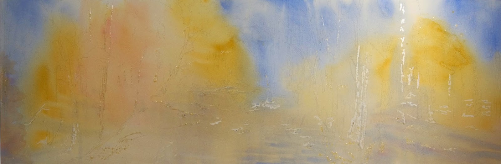
| By the Stream 24" X 72" SOLD |
 |
| Rolling Hills 44" X 58" |
Haven on the Lake is a new spa in Columbia, Maryland. Their vision is
Heal the stress of everyday life.
Boy did I ever need that before I switched my career to full time artist. Stress was the definition of my days. Even though I am no longer in the high stress world the services at Haven on the Lake sound enticing. Check out their website to learn more. The spa opens on December 6th for all Wellness Spa Services and on December 15th for Mind Body Movement classes.
 |
| Standing Tall 20" X 16" |
This new spa has art by area artists on display and for sale. I was one of the artists selected to have three of my paintings on exhibit. There are about sixty paintings on display for the next six months, then new art will be selected and displayed. A few other artists who also have artwork included at the spa are: Nancy Lee Davis, Diane Dunn, Debbie Hoeper, Deborah Maklowski, Pat Roberie, Cathy Sawdey, John Stier, Kathleen Stumpfel and Barbara Steinacker. I, for one, am anxious to see the spa and all the art.
The artwork changes periodically, so stop by Haven to see what is currently on exhibit.
Read more about my paintings by following these links:
Interested in learning more about April's art inspirations, tips about her painting process, or art business tidbits? Want to know when her art is in exhibits? Consider joining her friends and collectors by signing up for her twice-monthly email.
Copyright April M Rimpo 2016 All Rights Reserved. You may share my work with attribution and a link to this source site, but all other uses are prohibited.