Copyright April M Rimpo

Visit April's website www.amrart.org
Copyright April M Rimpo All Rights Reserved. You may share my work with attribution and a link to this source site, but all other uses are prohibited.
Showing posts with label pouring acrylic. Show all posts

Saturday, March 28, 2015

Cycles - A Work in Progress

The Spring paintings are just about out of my system now that the weather has improved. The threatened snow, predicted earlier this week, did not happen, so all is so much better in the world. 

Instead I started on a new painting that I plan to include in the "Modes of Transportation" solo exhibit I'll have later this year. So far the drawing for Cycles is done and the first two layers of poured paint have been completed. 


Cycles Step 1: Mask and First Poured Wash
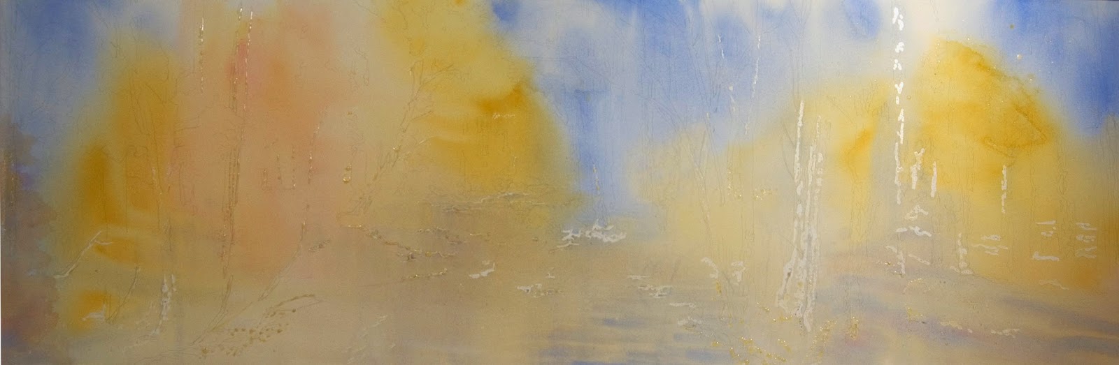
I wanted to show you photos I took after the first two pours to show how much the personality of a painting can change with color. The first image is shown at left. I wanted soft grays in this first layer with just a little tinting of lavender and orange-tan. The lavender is a result of Cobalt Blue mixing on the paper with Quinacridone Coral. The next photograph shows a closeup of the center of the painting where you can see there is a fair amount of variation in this layer, but only noticeable in the closeup image.

I succeeded in achieving a fairly neutral gray underpainting, but was worried that the finished painting would be too muted if I didn't take a much bolder step with my next pour.

I mixed a tan, orange, and Cadmium Red Light together in a cup and produced an orange I liked. That color excited me enough that I took out a different sheet of paper, thickened the liquid mixture with acrylic medium and placed some randomly on the paper. Next I took some tube acrylic Cerulean Blue added that to the paper and sprayed it with water to loosen it up a bit and let it run around.  I ended up adding some white liquid acrylic in a few areas to create some lighter areas.  I don't know what I will be doing with that full sheet, but I liked the color combinations and decided to use a much more subtle version of that for my next pour on Cycles

I slept on it and must admit each time I awoke that night I realized I was thinking about the painting. By morning I had a plan how I would use the colors I had experimented with to brighten Cycles without drowning it in so much color that I lost the first layer.  I had applied more mask to the painting to preserve linear areas in the motorcycles that needed the first lighter grays, but that didn't mean I totally wanted to obfuscate what remained of the first pour in areas I had not preserved.  This is where transparency of the pigment is so important.

Cycles Second pour: Adding a bright middle value
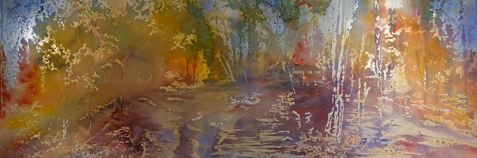
So here is the result of the second pour. I started with an orange mixture similar to what I had created the day before and applied it selectively along with some Quinacridone Coral and a tiny amount of a yellow blend that was predominantly Quinacridone Gold. I wet these pours and tilted the support board to get the oranges to move about until I was happy with their placement.

Next I  added some Cerulean Blue in a rhythmic pattern between the orange areas and some French Ultra blue near the top, outer edges of the motorcycles, and a little in the shadow area below the bikes. I didn't want the foreground to get dark, so I tilted the board toward the top of the painting and let the color flow and intermix on the paper. I avoided using a brush as much as possible because using complementary colors at the same time does risk turning to brown. The light lavender blends you see between the blues and oranges are from the first pour. Since these complementary colors did not touch very much.

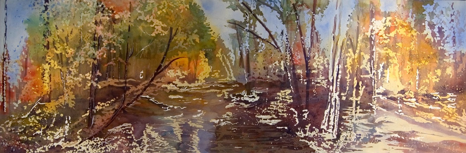
Here is another closeup from the center of the painting where you can see how the Cerulean Blue and Orange shades intermingled beautifully and the underpainting colors shine through. The Quinacridone Coral is visible in the tire toward the right from the first layer; Some green blends were created from the second pour where the Quinacridone Gold and the blues combined.  It is this wonderful intermingling of color that I love about watercolor and fluid acrylic.  This painting is entirely fluid acrylic but since I handle it like watercolor, watering down the paint so it flows on the paper, very similar results are achieved.

Now it's time for me to figure out the third, and likely last pour. I'll get to a medium dark value with the third pour and then I'll shift to my brushes to finish the darkest areas.

Tuesday, March 17, 2015

ISEA 1st Annual Members Virtual Exhibit


Inspiration by April M Rimpo
Last year I joined the International Society of Experimental Artists, entered and was accepted into their 23rd International Experimental Artists Exhibition. At that time I had just started pouring fluid acrylic and my painting Moving Up had been the result of my first poured painting. 

While doing that and other poured paintings I noticed that the painting started out as a very interesting abstract and gradually built to the image I wanted to portray.

This year, during the 30 Paintings in 30 days Challenge, I decided to create  some non-objective paintings as the starting point for a series of yoga poses that I planned to paint.  I used large sheets (40 X 50") when doing the pours so I could have a lot of variety to chose from when I later cut these sheets apart to make 8 X 8" wrapped "canvases" for the sections of the yoga poses.  My goal during the pouring was just to make some interest patterns and color combinations. I had not yet drawn the poses, so there was no masking intended to preserve areas for the final paintings.

After the backgrounds were done and I had drawn the poses, I selected sections of the non-objective, poured sheets that I thought I could use for the yoga poses.  When selecting the 8"X8" sections I looked for lighter areas that could be formed into the person and textures that would help accentuate the pose.  The next step was to draw the post across the segments and then add paint to help emphasize the human shape while still leaving each abstract segment as abstract as possible.  Until the four segments of "Inspiration", shown at left, were put together, it was difficult to see the figure. Even assembled it takes some looking to find her form in the painting.

Being quite happy with my result I decided to enter this pose (there are a total of six poses made up of 21 8" X 8" panels) into the ISEA Member Virtual Exhibition. I was so happy is was accepted into the exhibit. 

To see all the other experimental paintings by going to the ISEA website. I think the work is quite fascinating in this exhibit.  Do take some time to read the descriptions provided by each artist explaining why the piece was experimental for them, since being experimental is a personal experience.  I am so glad their is a group like this that honors each artist's personal experimentation. Two of my artist friends also have work in this virtual exhibit.  Please be sure to check out the paintings by Sue Marrazzo and Marilyn LeMay Patterson.  Sue Marrazzo also has a blog, so if you want to see more of her artwork check that out here.

Thursday, October 30, 2014

The making of "By the Stream", a 24" X 72" fluid acrylic on gallery wrapped paper

By the Stream by April M Rimpo
I love the colors of fall, so By the Stream, provided an opportunity to explore these colors.  Being a large painting it took a while to complete.  I found that I kept examining the leaves near my home every time I left the house.  As I drove around the area I enjoyed the little flecks of color that stood out in from on darker trees.  Each time I resumed work on this painting I brought that new knowledge with me.  


By the Stream
Fluid Acrylic on Varnished, Gallery Wrapped Paper*
24" X 72"
SOLD

By the Stream started as a poured painting.  This was the quickest approach to get some base color over the entire surface of the painting. You can see there was some masking fluid on the paper to preserve some white areas. After the paint dried over night, more masking fluid was added to save the sky, some of the light colors in the trees, and reflective spots in the water.

The next day I sprayed the paper with water then applied paint using a very large brush. Because the surface of the paper was quite wet, I tilted the paper to let the color intermingle, much like using a pouring technique. This started to define the water and structure of the landscape.


The image at left shows the result after one more painting session and removal of the masking fluid. As you can see, there is a lot of work to do to integrate the light areas where the mask was and make a cohesive painting.

In the image at right I've worked on some trees on the left and reflections in the stream. Here I was able to test out an approach for finishing the painting. While looking at this photo I realized I needed more light blue reflections on the right side of the stream to clarify the transition from the stream to the bank. 


The detail at left shows distant trees added to the light sky areas. I've hinted at bushes at the base of the trees and used greens as well as browns to indicate the depth of the woods. I am happy with these results, so I continued with the rest of the painting using the techniques used here. There is a great deal of push and pull between light and dark areas and between warm and cool colors creating a rhythm to the painting.  

I'd love to hear your thoughts on the painting.  Also feel free to ask for more specifics about my process.

Wednesday, August 27, 2014

"Struggles in the Sourthwest", 24" X 34" gallery wrapped fluid acrylic on paper

Struggles in the Southwest by April M. Rimpo
You may remember my June blog post called Pouring Paint, about a workshop I had taken from Linda Baker.  During that workshop I painted Harder Times which was a close up of one grave in Mission TumacĂ¡cori.  I designed Struggles in the Southwest earlier but decided it was too much to tackle in a workshop and went with the simpler version. I visited Mission TumacĂ¡cori sometime in the 1980s as part of my explorations of Arizona. After moving to Arizona in 1980, my husband and I continued to explore many National sites with Indian ruins during our 17 years in the state.  One of my interests, in fact my initial major in college, was archaeology, so visiting these sites allowed me to catch a glimpse of the past.  To learn more about this Mission visit the National Park Service site.

Like Harder Times this painting was poured, but with fluid acrylic instead of watercolor. Below are a few images showing steps in creating this painting.

Value Sketch
I generally start each painting with a drawing of the outlines of the shapes in the painting, but this one was complex enough that I decided to do a value sketch. The purpose of a value sketch is to work out the darks, mid-value, and lights in the painting. I admit I went beyond a value sketch and toward a much more complete drawing. However this was done on tracing paper to allow me to more easily transfer the drawing to watercolor paper.


The image at right shows the result of the first pouring of acrylic paint.  The acrylic was poured after I transferred the drawing, then masked areas I wanted to keep white. The first pouring uses the lightest colors in the painting, filling the role of the lightest mid-tone.  To accomplish this with acrylic, the pigments are very diluted with water.


When the first layer dries, more masking fluid is added to some areas where I want the lightest mid-tone.  A second pouring is done that has nearly the same amount of water mixed with the paint. Since it is on top of the first layer of color, it looks darker.  I added more blues to the second pour allowing them to mix with the Quinacridone Coral pigment to create lovely lavender shades in areas where there are shadows.


In this third process photograph I have added a few darker areas and, when the paint dried, I removed the masking.  

Notice the golden tan stripe along the left edge.  After I gallery wrap the painting over a stretcher frame, the stripe will be on the edge of the painting. Sometimes I run the image around the edge and sometimes I use color stripes.


This last photo was taken after several touch-up sessions. A variety of dark colors is added in the darkest shadows under the rocks and more color to the crosses. A great deal of work was done on the rocks to blend some of the dark edges and to emphasize the twigs and grasses in the sand around the stones.

There was a small amount of additional touch-up to finish the painting after this image was taken.  The finished painting in the top image shows just the front of the painting after gallery wrapping. 


Sunday, July 20, 2014

"Lower Falls" varnished 45" X 45" acrylic on paper - gallery wrapped

Lower Falls by April M Rimpo
Lower Falls
Fluid Acrylic
45" X 45" varnished and framed
$4850 includes shipping within the United States

Available for Purchase at Xanadu Online Studios

We travel to Yellowstone National park in Lower Falls.  This is my third 45" X 45" painting and I must say I am beginning to really enjoy working this large.  I poured the acrylic paint to get it started then came in with a brush for finishing work.  By reducing the amount of time a brush touches the paper, the amount of glow when the light bounces off the paper is really enhanced.

I loved how the yellow in Yellowstone National Park really pops on the light side of the canyon but becomes subdued with blue and burnt sienna tones on the shadowed side. The river too goes from nearly white where it reflects the light on the bright side to deep blues and purples in the shade.  It is like there are two worlds hidden in one.  The deep canyon lets us see both of these worlds at once.

Other landscapes by April can be seen in these other blog posts:

Friday, July 18, 2014

"Moving Up" 24" X 14" gallery wrapped fluid acrylic on paper

Moving Up by April M Rimpo


Moving Up
Fluid Acrylic on varnished gallery wrapped paper
24" X 14"
$925

Moving Up was created by pouring fluid acrylic paint on watercolor paper. This image was designed to be gallery wrapped, where the image of the cliffs wraps around the edges. As a result no frame should be used with this painting.  The artwork becomes part of your room as it projects 1.75" off the surface of the wall. 

I built up the depth of color of the cliff and the rock climber's form through progressively darker layers of poured acrylic.  I thin out the fluid acrylic to be much like a thin wash of watercolor so I can gradually build transparent layers. Masking fluid is applied to block out areas that I want to retain from each pouring. 
Detail of Cliff

I especially like areas where the difference in value (The lightness or darkness of tones or colors. White is the lightest value: black is the darkest.) is minuscule between layers allowing me to create very subtle and interesting patterns, like in this closeup detail of the cliff. 

At the bottom of the post I've added three photographs of the painting I took during its evolution so you can see how the painting changes from an abstract, to a shadow of the figure, to a more developed figure and cliff.  Three layers of mask and paint were applied when the third photograph was taken. An additional three or four layers were needed to finish the painting and add some finishing touches.

I'm very proud of the fact that Moving Up was accepted by juror Linda Doll in the
23rd Annual ISEA (International Society of Experimental Art) International Art Exhibition. You can see it from September 13th to October 12th, 2014 at the National Watercolor Society Gallery in San Pedro, CA. 

It was also included in North Light Publications Best of Acrylic book, AcrylicWorks3: Celebrating Textures.


You can see another painting of rock climber in my post The Apex.  That painting was created using fluid acrylic and watercolor, but the paint was not poured.

Saturday, July 5, 2014

"Standing Tall", 20" X 16" varnish acrylic on gallery wrapped paper

Standing Tall by April M Rimpo
View of gallery wrapped edge

Standing Tall
fluid acrylic 
20" X 16" varnished gallery wrapped paper
$500 within the United States*


A little whimsy to brighten your day in Standing Tall. These multicolored trees tower above the ground, so tall you can see a bit of the curvature of the earth.  Their roots intertwine and reach deep, anchoring the trees for all time. Part of me feels fairies might live among these trees.  

* Contact April regarding purchase outside the United States.

Interested in learning more about April's art inspirations, tips about her painting process, or art business tidbits? Want to know when her art is in exhibits? Consider joining her friends and collectors by signing up for her twice-monthly email.


Copyright April M Rimpo 2016 All Rights Reserved. You may share my work with attribution and a link to this source site, but all other uses are prohibited.

Friday, July 4, 2014

"A Time For Peace", 10" X 20" acrylic on 2" deep Wood Cradled Panel

A Time for Peace by April M Rimpo

A Time for Peace

fluid acrylic on paper
10" X 20" image mounted on 2" deep
Cradled Wood Panel
SOLD

Although we live in the Baltimore/DC area, we are west enough to be in a farming community on a wooded lot where we are visited by deer, foxes, and raccoons. My husband is faithful to the birds, feeding them during the winter months to make sure they survive.  The variety of birds is more limited in the Winter since many species have flown south, but the population of doves seems to increase.  Lucky for us, some remain for the Spring and part way into Summer.  This dove did stay for Spring and one morning when looking out across our backyard I noticed her sitting  on a tree limb; she looked as though she too was enjoying the quiet morning and the dapples of sun that had begun to sprinkle into the wooded area.  A Time of Peace is intended to recapture the serenity I felt that morning looking out on the dove.

For those of you who follow my posts regularly, you may recall I recently mentioned learning a watercolor technique where you pour the paint.  In that post I said I wanted to try this approach with acrylics as well.  This painting was my first journey down that path.  

I use fluid acrylic paint, which means the paint is thinned with water until it flows like watercolor.  However, one major difference is that acrylics dry quickly and, once dry, are essentially permanent.  They cannot be lifted off the paper as you can do with watercolors. In order to achieve the soft, nearly pastel look to this painting, I needed to use very dilute acrylic in each layer to keep the paint from getting thick and opaque. Using a light touch also allowed me to add layers of paint to change the hue in an area if I was not satisfied with an earlier pouring. I actually found I could accomplish pretty much the same result with the fluid acrylic as with the watercolor paint.  

I have also learned that I very much like using a pipette to spread the paint around the paper since it is easier to control how much paint I apply.  When truly pouring from a container, I have occasionally gotten too much paint and then it can be difficult to remove the excess quickly enough, especially with acrylic.  I'm sure I'll continue to use pouring (or maybe I should say "pipetting") in my acrylic paintings since I like the random colors in the washes and the extra glow that I can achieve.

* Contact April regarding purchases outside the United States


Most Popular Posts This Month

Most Popular Posts of All Time