 |
| And the Excitement Begins by April M Rimpo |
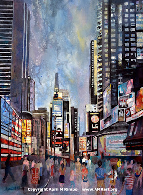
And Let the Excitement Begin
Fluid Acrylic
24" X 18"
Mounted on 2" deep cradled wood panel
$1175
I love painting light and shadow to catch a moment of time, but I also love to include people in paintings. They help me tell the story of a place and times. I generally don't know the people and am not striving to make them recognizable. It is their posture and what they are doing that is important to the story.
Some say paintings with people won't sell.
I find that hard to believe. I frequently notice paintings in a variety of public places that have people in them. And what about famous artists like Winslow Homer? He frequently included people in his work. His motivation was also to tell their story. Perhaps this is why I so love his art.
In fact, many workshops are given on the topic of including people in the landscape. The workshop descriptions often say something like, "Improve your landscapes with figures that engage the view and create a personal involvement in your painting."
What do you think about paintings with people? Do you like them or not? I'd love to hear your thoughts.


They are perfect in an urban setting, but I tend to avoid people in landscapes as they draw the eye too much.
ReplyDeleteThis is a super painting!
Interesting distinction. I do occasionally put a tiny figure in a landscape, but generally not. That wasn't a conscious decision but now that you mention it I must have had the same feeling. Thanks, Rolina. Glad you like the painting. I did this painting right after the 30 day challenge, starting with the runny drips and then adding the city on top. I like the added texture. I've done that with a few paintings and like the look.
DeleteMy daughter Caroline is working on a Painting badge for Brownies and she needed to select a painting to share with her troop. We visited the Horse Spirit and she selected this painting as her favorite. We were recently in Times Square and she said this reminded her of that trip. The owner shared more information about your techniques and Caroline is very excited to tell the other girls about you. Thank you for your talent!
ReplyDeleteI love how it reminded her of your trip to Times Square. I always feel successful when I bring back memories of a place for someone. Tell her congratulations on her Painting badge once she gets it.
Delete